Funnel optimization: turning leads into customers
The idea of sales funnels can feel misleading. A real funnel is designed to catch and condense everything you put into it, but not every prospect that enters the top of your sales funnel will come out the other end a customer. There’s bound to be some spillage along the way. However, that doesn’t mean you should settle for a slow drip of conversions. With the right approach, your business can generate more leads at the top of the funnel and more deals at the bottom.
Sales funnels are sales and marketing tools used to illustrate the steps of the customer journey. Think of a sales funnel as a visual roadmap that shows exactly where a prospect is in the buying process at any given time.
A sales funnel is important because it allows you to understand what potential customers are feeling and thinking as they move along the path to purchase. Knowing where prospects are in their journey gives you the insight you need to identify the best marketing strategies. As a result, conversion rates and sales will increase over time.
Good sales funnels guide prospects toward a purchase by capturing their attention, nurturing their interest, and ultimately closing the deal. When all goes well, sales funnels also set you up for good reviews and repeat customers.
In this article, you’ll discover the secrets to optimizing your sales funnel and converting more leads into paying customers.
1. Creating a seamless user experience
User experience (UX) is an all-encompassing term, which refers to every tactile and emotional engagement a user has with a product. This could be how easy an app is to use, how readily a website is navigated, how intuitive or ergonomic a device is to handle, or how these experiences make the user feel.

User experience is not concerned with one specific part of a user’s journey. Instead, it views the experience as a whole a holistic combination of usability, emotional value delivered, pain points, frustrations, rewards, and task completion. Essentially, user experience can be used to describe the total experience of every touch-point a user interacts with, throughout the entire customer journey.
What is the Importance of UX Design?
Customers’ desire to utilize a product, its superb functioning and meaningful experiences are all included in user experience design (UX). Clients can find and utilize items without difficulty from any device, thanks to the work of UX designers. They look after a certain product’s values, features, usability, accessibility, and aesthetics. When customers connect with the things that designers create, they find them to be high-quality, simple to use, and enjoyable. A business may better serve customers’ demands and boost customer happiness and loyalty by using excellent UX design.
Steps in creating a seamless UX:
- Concentrate On The Actual Clients
One of the guiding principles of user experience design is to keep users’ requirements, intentions, goals, and challenges in mind at all times. Any business’s main objective is to satisfy its clients. A thorough comprehension of these essential user factors helps designers create personas and keep these personas in mind as they go through the design process. Without taking into account the people themselves, a UX designer cannot provide a good user experience. It is essential to do research and analyze user behavior to make sure the product is successful.
Using a combination of common user research techniques, including interview sessions, research, participant observations, contextual inquiry, etc., one may identify the actual requirements of customers. - Design It With Purpose
Establishing relevance is just as vital to creating meaningful user experiences as the idea of usage. What else would develop if you added a new product that would be useless to your current users?
Before starting a new project, whether you’re creating a brand-new item or including extra features, be sure it is relevant. This was such product-market fit and figuring out whether people are drawn to your notion or idea.
- Consistency
Consistency is another important component of UX design principles. Consistency is an indicator of a superior user experience design across the user’s contact with the product. Since they don’t have to redesign or produce fresh designs each time they embark on a new job, consistency simplifies the design process simple for the designers.
Customers benefit from a shorter learning curve and quicker product acclimatization. Enhancing and sustaining voice and visual language as part of design consistency increases the likelihood that customers will remember your company.
A user who experiences inconsistency is less likely to use your product again because uneven UX design causes uncertainty and resentment in the user. On the other hand, consistency aids organizations in establishing the worth of their offerings as well as their reputation and level of trust.
- Minimalist
This principle lessens the stress on users’ cognitive and operational resources or UX. This enhances the uniformity and usefulness of the design. The minimalistic design concept emphasizes simplicity and tries to stay away from complicated or time-consuming designs. This UX design idea has led to the creation of several successful designs, including well-known Apple products. - Storyline
The goal of narrative design is to communicate a story via your design. Time and flow are two essential narrative components to maintain audience engagement, and user attention is greatly influenced by the speed and flow of the material.
A speed that is too sluggish will annoy your user, while a pace that is too quick can confuse them if they lack the necessary information. There must be a balance between the pace and flow of information.
2. Implementing persuasive call-to-actions
A Call-To-Action (CTA) is a call-to-action button that appears on websites and advertisements to encourage users to take a particular step, such as making a purchase, downloading a file, or subscribing to a newsletter. A good and effective CTA is concise, clear, and action-oriented. It is placed in a prominent location, has a contrasting color, and uses persuasive language.

The concept of a CTA originated in direct marketing and has since become a widely used strategy in digital marketing. 90% of visitors who read the headline read the CTA, according to sample statistics. Including a CTA on the homepage increases conversions by 121%. Using the word « now » in a CTA increases conversions by up to 90%. The average click-through rate for a CTA is about 1-2%. »CTAs are important for email marketing because they provide the next step for the receiver to take, leading to higher conversion rates. » It helps track the success of an email campaign and determine what actions are most effective for a specific audience.
Steps to implement persuasive call-to-actions:
- Incorporating clear and concise messaging in call to action
Clarity is key when it comes to call to action designs. Users should be able to quickly understand what is expected of them and what they will gain from taking the desired action. Avoiding jargon and using clear, concise, and direct messaging ensures that users are not confused or hesitant about clicking the CTA. A well-crafted message can increase the conversion rate by minimizing friction and ambiguity. - Designing compelling and visually appealing buttons
When it comes to CTAs, buttons are the most commonly used element. Designing visually appealing buttons that stand out, are easy to locate, and clearly communicate the desired action is essential. Experimenting with different shapes, sizes, colors, and visual effects can help capture attention and create a visually cohesive design that entices users to click. - Choosing the right colors and typography for call to action
Colors and typography play a significant role in call to action designs. Different colors evoke diverse emotions and convey specific messages. Carefully selecting colors that align with the brand’s identity and desired user response is crucial. Similarly, typography choices can impact readability, legibility, and overall design aesthetics. Opting for fonts that are easily readable and visually appealing can enhance the effectiveness of the CTA. - Using persuasive language and copywriting techniques
Copywriting is an art that can elevate the impact of call to action designs. Crafting compelling and concise copy that highlights the benefits, urgency, and value proposition of the desired action can enhance persuasive appeal. By using action-oriented words, incorporating power words, and employing storytelling techniques, designers can create CTAs that emotionally resonate with the audience and compel them to act. - Strategic placement of call to action on web pages
The placement and positioning of a call to action can significantly impact its effectiveness. Strategic placement involves considering the natural eye flow of users while balancing the prominence of the CTA. Positioning the call to action in visible areas where users are likely to focus their attention, such as above the fold or within content breaks, can increase the chances of engagement and conversion. - Optimizing call to action for mobile and responsive designs
In the era of mobile browsing, optimizing call to action for smaller screens is crucial. Designers must ensure that CTAs are easily tappable, legible, and appropriately sized on mobile devices. Additionally, responsive designs require adapting CTAs to different screen sizes and orientations to provide a seamless user experience across various devices. Testing and fine-tuning the responsiveness of CTAs is pivotal to maximizing conversions on mobile platforms.
3. A/B testing different funnel stages
Funnel testing is assessing what works at different stages of the marketing funnel. For example, ads that work at the conversion stage might not work well at the brand awareness stage. This goes for ad messaging, landing pages etc. too. This is all about finding out the most effective ad mix at the right stage.
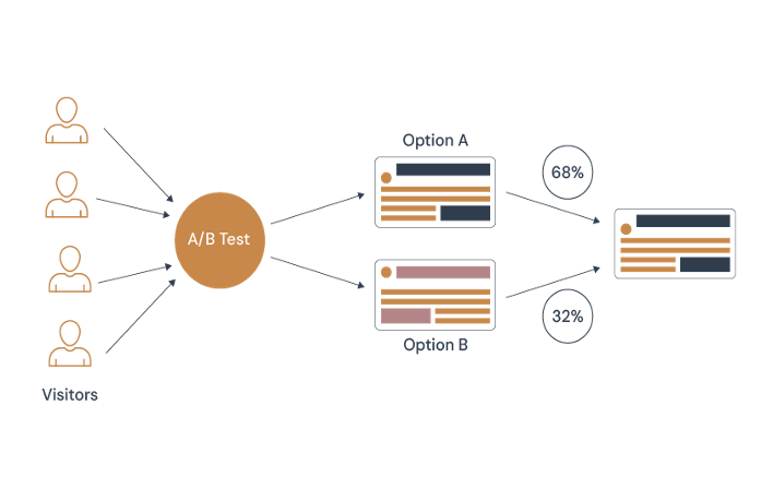
A/B testing is a method of comparing two versions of an ad, ad copy, web page etc. against each other to determine which one performs better. A/B testing is essentially an experiment where two or more variants of ads, or landing pages, are shown to users at random, and statistical analysis is used to determine which variation performs better for a given conversion goal.
- How to set up a funnel for A/B testing
Before you start A/B testing your funnel, you need to define your funnel stages and track them using a tool like Google Analytics, Mixpanel, or Optimizely. You also need to identify your target audience, your hypothesis, and your primary goal. For example, you might want to test whether adding a video testimonial on your landing page increases sign-ups for your online course. Your funnel stages could be landing on the page, watching the video, clicking the sign-up button, and completing the registration form. Your target audience could be new visitors from a specific
Source, your hypothesis could be that the video testimonial increases trust and interest, and your primary goal could be the sign-up rate.
- How to choose the best metrics for A/B testing your funnel
The best metrics for A/B testing your funnel are the ones that directly relate to your primary goal and reflect the value you deliver to your customers. They should also be measurable, actionable, and consistent. For example, if your primary goal is to increase sign-ups, you might want to measure the conversion rate at each funnel stage, the average time spent on the page, the bounce rate, and the retention rate. These metrics can help you evaluate the effectiveness of your test variations and identify the areas of improvement.The final step of A/B testing your funnel is to apply your learning’s and make data-driven decisions. Based on the results of your test, you should implement the winning variation, run another test with a different hypothesis, or discard the test and try something else. You should also document your findings and share them with your team, as this can help you improve your future tests and optimize your funnel. A/B testing your funnel is an ongoing process that requires constant experimentation and iteration. By choosing the best metrics for your goals, you can make sure that your tests are meaningful and impactful. - How to apply your A/B funnel test learning’s
The final step of A/B testing your funnel is to apply your learning’s and make data-driven decisions. Based on the results of your test, you should implement the winning variation, run another test with a different hypothesis, or discard the test and try something else. You should also document your findings and share them with your team, as this can help you improve your future tests and optimize your funnel. A/B testing your funnel is an ongoing process that requires constant experimentation and iteration. By choosing the best metrics for your goals, you can make sure that your tests are meaningful and impactful.
4. Utilizing exit-intent pop-ups
An exit-intent popup is a message that appears in front of users when they move their cursor towards closing the tab. Marketers create these popups to keep users from leaving a site and convert them into subscribers, leads, or customers.
Why should I set up an exit-intent popup?
Exit-intent popups are crucial because they allow you to recover up to 53% of visitors that want to leave your website. As a result, you can continue building your relationships with the audience. The most popular type of exit-intent popup is a subscription popup with a lead magnet.

These messages ask users to share their email address in exchange for something valuable, like helpful or entertaining content, discounts, free e-books with hacks, etc.
Exit intent pop-up best practices
Here are some recommendations to help you make your exit pop-up more attractive and convincing.
- Put your pop-up in front and at the center to be noticed
With exit intent pop-ups, you shouldn’t be too modest make sure yours actually pop and grab attention; otherwise, the user will proceed to another tab without even noticing it. If you’re creating your pop-up with SendPulse, use the overlay mode, which darkens the main content of the page. - Offer something real and valuable
You won’t retain your users by simply asking them to hang out on your website a little longer, and that’d be unfair to distract them without offering anything of value. So, you may want to use one of the following incentives:- a freebie like a eBook, whitepaper, webinar, manual, etc.;
- a discount;
- access to an exclusive offer;
- a free discovery call;
- a free consultation;
- a personalized program.
- Choose relevant engagement elements
When designing an exit intent pop-up, keep in mind user experience and choose elements that make sense for your specific page or user journey. Choose relevant freebies and copy to match user intent. When using a pre-designed template, check if everything makes sense and spend an extra minute customizing it if needed. - Set reasonable display conditions to avoid annoyance
No one likes being bombarded with intrusive messages within seconds, so set appropriate pauses between various pop-ups or notifications. For example, if your customer has just closed another promotional widget, there’s no need to bother them with an exit intent pop-up. - Optimize your layout from time to time
The goal here is to avoid showing the same exit pop-up to the same people over and over again. You need to either serve them different versions or make sure that it’s only shown once. - Make sure your layout is responsive
You want your pop-up to look good on PC as well as on tablets and mobile devices. The easiest way to achieve that is by using a pop-up builder that offers responsive customizable templates. In SendPulse, there are over 30 mobile-friendly templates and an option to preview your widget on different screen sizes. - Track how your pop-up is performing
It’s imperative that marketing teams track metrics related to their efforts, and pop-ups are no exception. Our platform allows you to get a quick overview of how many clicks, views, and leads your pop-up has gathered, so you won’t have to do any guesswork.
At the end of the day, it isn’t just about creating a sales funnel, it’s about optimizing it too. While some leads are always going to slip through the cracks, visualizing the customer journey and providing value to prospects can lead to an uptick in your sales funnel conversion rate.
Focus on every step of the conversion path and guide potential customers through your sales funnel stages. With enough time and effort, you should start to see more engagement, more conversions, and ultimately, more sales.


